Digitip 073 – Adobe Illustrator CS3
Illustrator has had a graph tool for as long as I can remember. The following trick shows how you can use Illustrator graphs to create a 3D pie graph for which the graph data can still be edited.

Let’s get started by entering some basic numbers 🙂
Create Graph
Start by selecting the Pie Graph Tool from Tool panel.
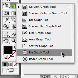
Click and drag the area you’d like the graph to cover, when you release the mouse button, the graph data window appears. Alternatively click in the artboard to set width/height for the Graph in the Graph dialog.
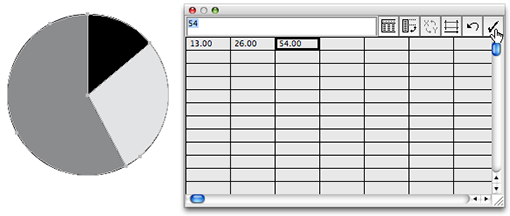
Enter the graph data or copy and paste data from an Excel worksheet into the graph data window. Click the Apply button in the top right corner of the graph data window to view the ‘flat’ pie graph. And close the graph data window when the data entered is OK.
Set Graph Colours
Graphs are groups. It is important to remember that when you’re working with Graphs in Illustrator and wish to edit colours or other parts of the graph, you do not ungroup the Graph at any stage, especially if you still want to edit the graph data at a later stage.
As far as I can tell the Isolate Group functionality from Illustrator CS2 and CS3 does not work on graphs. I guess that makes sense in a way, as it would allow you to add non-graph objects to the graph.
So how do we select parts of the graph if we want to change say colour? Well this is where the good old Group Selection Tool comes in handy 🙂 It’s hidden behind the Direct Selection tool (or if you have the Direct Selection tool selected will be accessible when you press the Alt/Option key in combination with this tool).
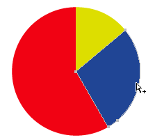
Using the Group Selection Tool select the different pieces of the pie (don’t eat them!) and change their colours.
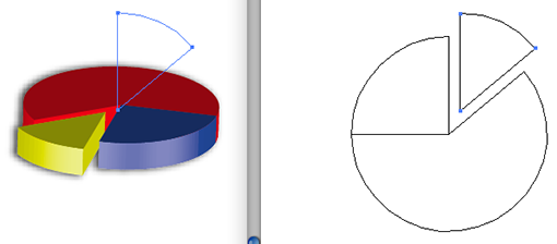
Putting some depth in the pie
Time to put some depth in the pie graph 🙂 Select the graph with the Selection Tool.

Select Effect > 3D > Extrude and Bevel.

Tick the Preview option in the dialog to preview the 3D effect you are creating. As I’d like to get the yellow part to be positioned to the front of the graph I’m dragging the various edges of the X, Y and Z axis to specify the correct rotation angles.
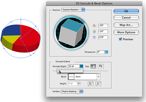
To change the depth of the pie graph, reduce the Extrude Depth setting. The slider is a bit sensitive, so I generally enter the value manually.
Click the More Options… button in the dialog to edit shading effects. I’m adding an extra highlight and have changed the intensity a bit to generate a different lighting effect.
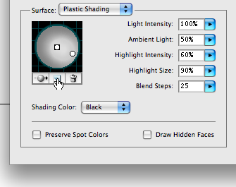
For commercial printing I’d advice increasing the Blend Steps, as this will create smoother blending of the shading effects. In the past RIPs might have had issues processing a high amount of blend shades but now-a-days I doubt that would be much of an issue.
Once you’re happy with the 3D view of your graph click OK.
Moving a piece of the pie
Once you’re viewing the 3D chart it appears to be difficult to select that piece of pie you’d like to ‘eat’ 🙂 Changing the View mode to Outline mode will help, but you can’t preview at the same time. A little trick you can apply is to create a New Window for your document (Window > New Window). This allows you to set one window in Preview mode and the other in Outline.

If you’re working on a Mac you won’t have an option available that allows you to tile the two windows. So you’ll have to resize your windows and move them around to display them side by side.
It’s time to select the Group Selection Tool again and start moving that piece of pie. I’ve noticed on my mac that the preview doesn’t quite update but an incremental zoom-in/out on the preview window will refresh the preview without any problems.
When you’ve achieved the required result you can close the second window you opened and set to Outline mode.
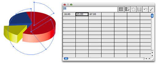
Editing the graph data
As I mentioned earlier, you will be able to edit the graph data as long as you haven’t ungrouped your graph at any stage.
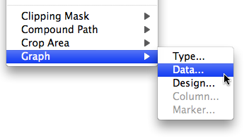
Select your graph with the Selection Tool and choose Object > Graph > Data. The data window will reappear. Make the desired changes and apply the new data settings to the graph, then close the data window.
Editing the 3D effect
If you’re not happy yet with the actual 3D effect, you can continue to make changes to the various 3D Extrude & Bevel settings you’ve applied.
Select the graph with the Selection tool and display the Appearance panel.
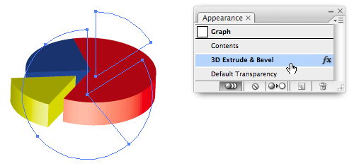
Locate the 3D Extrude & Bevel Effect that’s been applied and double click this to return to the 3D Extrude & Bevel Options dialog.
Although this tip is kind-a cool, I have to admit the whole editability (not sure if that’s actually a word…) doesn’t quite work as nicely when your graph contains labels.
If you happen to have found a work-around to this that works, let me know and I’ll happily add a note to this tip to include the extra information.
@jlou Could it be that the Ink Manager is set to “Convert All Spots to Process”? Also certain effects / blend modes in Illustrator when applied to spot colours WILL cause colour conversion to CMYK. — Cari
I am creating an extruded & beveled pie chart in Illustrator using spot colors in and importing the graph into InDesign.
In Illustrator have checked “preserve spot colors” and in the overprint preview window it appears that my spot colors are ok.
But when I pull the charts into InDesign and look in the color separations window my spot color disappears! Very frustrated.
Hi Cari, some good tips here thankyou.
Can you help with adding column totals to bar graphs? I’ve worked out how to do that and make sliding column design so text doesn’t stretch but for quite small percentages the columns drop below the x axis. I’ve tried placing the sliding guide in various places (including very near bottom to no effect. Help.
Awesome tut! Thanks!
The most important thing is that you do NOT ungroup your artwork at any stage.
Thanks for any help.
This is a very good post! Keep them coming!
hi Tania,
Double click on the Graph with the Selection Tool and you should jump into Isolate Group mode… that in turn enables you to use the Selection tool to move the pieces apart without ungrouping the Graph.
Hope this helps.
Cari
Dear Cari,
Thanks for this wonderful tutorial! it has been so easy!
But still can’t figure out how to move the pieces of the pie! I am a Mac user (AI CS4). Will need to practice!
@greg you can resize the graph by using your scaling percentage option. 🙂
Tania
@Greg
The most important thing is that you do NOT ungroup your artwork at any stage. As soon as it becomes ungrouped things will fall over.
Hope this helps.
Cari
I am having the same issue as Kathy. While I can edit the data and change colors, most of my AI options are greyed out: I cannot resize the chart nor can I select anything in the effects menu. I tried a simple shape as suggested above and the effects work fine -the problem is only w/charts. Any ideas? I am in CS3.
@Kathy hmmm… s.th not quite right from the sounds of it.
Can you try and draw a simple shape filled with colour on your art-board and see if Effects > 3D works on that (just to ensure there’s nothing wrong with the document itself).
Also try creating a small new pie-chart (with some bogus data), just the chart, no legends, and select it, try the command.
Does that work?
Cari
After I color the parts, I select the whole pie and go to effects>3D and its greyed out. It’s driving me crazy.
Thanks for any help.
@Richard
Thanks so much for chiming in on this one. Only just seeing Monica’s notes. Basically I find that if you do use Labels and legends things don’t work as nicely. E.g. I’d add those manually using the Type tool, rather than as part of the pie chart data.
Cari
Hi Richard, thank you!
I got the point…im going to examine my data again…maybe i will do the same as your team did 🙂
About the 3D tool problem: i suppose there must be a better solution. There must be a (simple and infallible) way of having a pie in 3D, but not the legend, rotated and extruded in the correct position…
i will send the solution, when i have it!
thank you, sincerely.m
Absolute life-saver!
Thank you for the clear and concise instructions.
@23 Monica – I’m having exactly the same problem and couldn’t find a solution at all…
The pie chart is created, *with series labels* on the top row of the data table. The chart works fine in 2D.
Following the above instructions, I select the pie ‘pieces’ (just the graphic part of the chart) and apply the 3D settings as advised above. The labels remain in 2D, but the chart pieces fly all over the place – some end up appearing higher on the page than other slices, some end up behind other slices, it’s really, really weird.
I think it’s because each piece is independently rotated / extruded / transformed by the 3d settings. This wouldn’t be a problem if it were a normal path, you could just group the pieces together thereby ensuring there’s a central reference point, and then apply 3D. But because it’s a chart you can’t group the pieces as special rules apply for chart objects.
It doesn’t look like you can both automatically feed data labels *and* at the same time have a 3D pie chart.
To get around this, I:
– created a 3D chart without data labels
– added a new layer
– manually entered data labels to the new layer
– used the eyedropper tool to copy colours from each label to the corresponding chart piece
– converted the chart to 3D
One final note – if you have HEAPS of data to display, I’d strongly suggest that you DON’T use a pie chart. Read this article http://optional.is/required/2009/07/20/pie-charts-and-other-circular-visualizations/ for further reference. Once I passed this article around to our sales team, there were far fewer requests for horrible big pie charts!
ok! i know what was my mistake! nervous mouse click!!
Its only need to hit the colour once to choose it, and twice to select the correspondent colour in the legend. (A+ tool).
Now a new problem…my chart has a lot of slices..when i use the 3D effects tool, the pie “explodes” and its impossible to understand anything.
help.please.
thank you,m
hi Cari,
It was very helpful, thank you.
The only thing left is to update the caption … It doesnt assume the new colors that I entered. Where am I wrong ?…( it works if I put the chart back again- after saving the new colors- but it isn’t able to “update”. Is it always need to use the window Recolor artwork? Does not work only through the swatches?)
Did I make myself clear?
Is there any possibility to separate automaticaly the slices? Like explode?
Thank you!!
Sorry about my english!
hi i’d like to make a pie chart that shows 0.005% but am struggling to get the spreadsheet to accept this value. i know its small. it is the amount a currency transaction levy would tax on currency transactions. i hope to zoom in on a coin to show how small this would be.
I am also stumbling when i get to the step to use the selection tool and then go to effects-3d- bevell. when i click on my flat pie chart the effects drop down is greyed out/ inaccessable. and when the pie chart is not selected it is. please help.
best wishes sonia
Great tutorial! Thank you!
Is there a way to edit and change the size of the pie graphs after applying colors and effects?
The steps were easy to follow and they helped me do what I needed to do. Thank you.
I tried following the directions, but kept getting an error that said “A pie chart must contain non-zero data.” Now, I’m entering dollar amounts, not percentages of 100%. Is that why it won’t render the chart? How can I simply enter my dollar amounts for each category, have Illustrator figure out the percentages of 100%, make my key/legend, and render my chart? This is about the 4th tutorial I’ve looked at, and nobody mentions in what format the data must be in. (i.e. you can only enter a known percentage of 100% into the data cells.)
Michelle, what is the exact data you are entering in the data area? are you possibly entering the $-signs in the graph data? Only enter the numbers and see if this works.
”
I found this post extremely intriguing – keep it up ^^
About your design, which template do you have here? I’d love to know where I can get a copy.”
Hi eq2. The original WordPress theme design I used has a link at the bottom of my pages. However, I edited the CSS to use my own colour ideas, images, text formatting styles etc. and added some WordPress plug-ins. If you start out with the base ThemeDesign you should be ok. It’s been updated since I started using it.
after I create the pie chart and save it as a pdf, I get these little vertical white lines between the different blend steps on the “front” of the pie. I think it does that when it flattens the transparency.
Is there any way to avoid this???
John,
The vertical lines you see are the result of transparency flattening. Really little to worry about. It’s basically to do with the artwork being broken up into little atomic regions and the monitor not quite knowing whether to show a solid join or not (think that has to do with pixels on screen). You can make them disappear (visually on screen) by changing your “Smooth Line Art” setting in Acrobat’s or Adobe Reader’s Page Display preferences.
To avoid them altogether save your PDF as version 1.4 or higher (Acrobat 5 upward compatibility). This will retain original transparency.
Hi Andy, not that I know off. and to make it worse, if you leave the graph grouped and rotate the labels, then edit the data, the labels will end up back in their original spot.
Fingers crossed Adobe will make some improvements/add enhancements in future releases of Illustrator. The Graph Tool and its features have not had any major overhaul for a long time 🙂
I’ve been trying to do some bar charts from within Illustrator, but i can’t find an obvious way to rotate the category labels when the bars are close together. At the moment the text for each bar overlaps and is unreadable.
Here’s an example of how i would like to fomat it (end of the page)
http://www.adobe.com/designcenter/illustrator/articles/illcs2at_chart_05.html
Is there any way to do this without individually selecting and moving each label? If i move each label individually, any changes are lost should i change the data. Thanks for any and all help!
My wedges are not coloring all the way through. It seems as though the color applied to the top layer only.
Any suggestions?
Hi Sandra,
Do the pie pieces have a stroke applied to it? if yes, then set the stroke colour to [None]
Does that fix it?
Cari
When I follow these steps, my depth turns out gray, like a shadow, instead of keeping the color of the “pie” sections. Any suggestions?
Nope, not that I am aware of.
The graph feature in Illustrator has been in ‘static’ mode for quite a few versions now. Definitely a good one to add to the feature requests for improvement of the graph functionality in Illustrator 🙂
submit feature request
Is there a way to have illustrator show the data numbers when it creates a graph like the show data numbers in the Freehand graphic tool?
You’re most welcome Plaguna 🙂
Thank you, It was very helpful. How to Change the colours was giving me a hard time!!!
🙂 glad to hear the tip helped 🙂
thank good for Cari – its been driving me crazy trying to change the colour of the wedges!!!!