I’ve used paragraph rules from my early days when working with that other page-layout application back in the late 1980s (yes, I’m THAT old!). I used them to create the horizontal lines in tabular tables before table styles were invented (I was the “annual report girl” in my production days), and I have used paragraph rules for a long time as a way to create ‘reversed out’ text.

So yes, paragraph rules have been around for some time in various layout applications indeed…
The following tip shows you how you can use paragraph rules in InDesign to create a shaded tint behind a title and heading paragraphs. It shows you how you can work with a single paragraph style to apply shading behind single and double line paragraphs.
About Paragraph Rules
Paragraph Rules are lines that attach themselves to a paragraph. This means that if this paragraph were to move due to text reflow in your document, the ‘lines’ would move with the text.
I’ve already created a paragraph style called ‘ad Title”, so let’s start by editing this style.
Right-click the style name in the Paragraph Styles panel, and from the contextual menu that appears choose Edit “ad Title” (or other style name in your case)
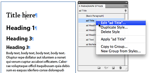
The Paragraph Style Options dialog appears. Click Paragraph Rules on the left.
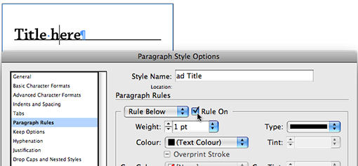
A paragraph can contain two paragraph rules, one above and one below the text. For now let’s focus on just enabling the Rule Below, by checking the Rule On option.
Note: If you’re not using a paragraph style, or intend to define a style later on, then choose “Paragraph Rules” from the Control Panel menu, or the Paragraph panel menu.
The default rule is 1pt in (Text Colour). If you intend to change the colour of your text to “white” (paper) as way of generating a reverse text effect, then remember that leaving the Colour setting on (Text Colour) will result in the rule turning “white” as well 🙂 .
Let’s have a look at the settings I’m using for the shaded effect.
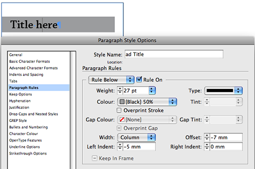
I’ve increased the Weight, which is the thickness of the line, changed the Colour to [Black] 50%, and moved the vertical position of the Rule by amending the Offset value. Ensure you have Preview enabled so you can see the movement of the rule as you’re changing the value.
My Rule Width is set to Column this means that the rule will fill out to the full width of the text column. As my Text Frame has a 5mm Text Inset (Object > Text Frame Options) set on it, it means that a 0mm Left Indent will not draw the rule to the edge of the Frame. I’m therefore giving it a negative indent of 5mm.
Note: you can actually expand the paragraph rule past the text frame itself, to create the effect of the rule sticking out of the frame, just increase the negative indent value even more to create this effect.
Cool so we’re done with this Paragraph Style now? No not quite. Let’s assume that every now and again the heading (ad Title in my case) wraps over a second line. Oops, that doesn’t look right (see below).

So how do we fix this so that we can use the paragraph style for single and double line paragraphs? Well the trick is in the Rules! Remember at the beginning I mentioned there’s a Rule Above and Below option?
Well let’s Edit the paragraph style once more and this time enable the Rule Above.
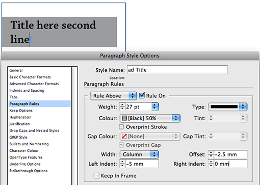
Generally I’d make the Rule Weight identical to that of the Rule Below. Indent, Colour and Width setting identical as well. Where you’ll have to play a little is with the offset.
Basically get it as close to right as you can. Then remove the second line and check that the Rule Above and Below nicely overlap each other when the paragraph is only a single line para. I tend to temporarily change the Rule colour to make it easier to see this. Make the final Offset adjustments and you’re done.
Updating a paragraph style
Ok, so after fiddling with the rules on the paragraph style, I decided I wanted to change the text colour. Being a little lazy, I opt to just highlight some sample text and change the Text colour to [Paper] in the Swatches panel.
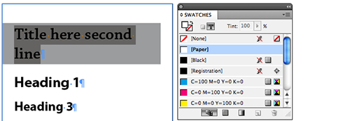
As a result, the paragraph style now displays a + symbol next to it. It’s telling us the selected text has a paragraph style applied to it PLUS something extra. This extra bit is called a style override. If you leave your cursor hovering over the style long enough you’ll see a yellow tool tip that tells you exactly what the overrides are.
So what if you want to incorporate these overrides in the paragraph style? I remember back from my days with that other layout application, that we’d create a New style and then delete the Old style replacing it with the New style… Man, that was a lot of work.
Luckily things are a much, MUCH easier in Adobe InDesign.
Right click the style with the overrides, then choose Redefine Style. This updates your style with the override changes.
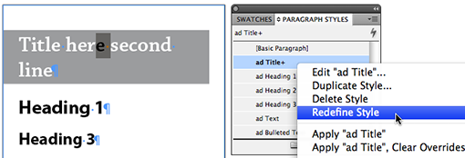
We’re all done now. Let’s have a look at the single and double line paragraphs now:
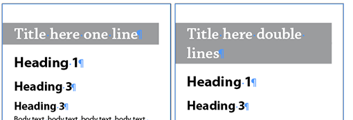
Beautiful! Just like I wanted things to be.
Video Tutorial
Is there a way to get a text-width (not full column-width) paragraph rule to sit above or below an “Exhibit Number” that includes the chapter number, section letter, and the paragraph number (and thus is variable in width)?
Hi Cari, Your tutorials are amazing! They have really given me some great ideas for training GREPS and styles in my upcoming Indesign courses. Thanks from across the Tasman.
This was sooooo helpful! I wasn’t getting result I wanted until I read this and now… well its smooth sailing ahead. Thanks!!
I was extremely happy to find this piece of information! I am working on a book where I need an ever-changing line of text in my masters to block out a white line in the background. In layer order from bottom to top, I have a black box, a white background line, the clever paragraph rule in black, and white text on the top. I have suddenly run into one major issue. When outlining the text for print, the paragraph rule disappears and the white line in the background is again visible. What to do? Thanks!
@Peter great historical addition Thank you! I missed the Typesetting lessons at TAFE, as I specialised in Prepress Technology in my days, but used to process the galleys set by our typesetters, they could perform some real magic… on those green/black terminal screens.
We used to use this method also on the old Compset and Varitypers, very different to this method but the same principals, back then it was all coding and no preview so you had to get it right before you committed the image to film or bromide, and sometimes you got some very unpredictable results, which was prob how they realised you could get reverse type
@Tracy
I love my paragraph rules. 😉
Your such a clever little girl 🙂