Updated 7 June 2011 (added additional notes ).
One of the new InDesign CS5.5’s EPUB Export Option features is the ability to control whether images are exported with Fixed width or Relative to Page Size setting. In this blog-post I’m running through a few findings.
I’m only looking at the Fixed / Relative to Page Size settings in this blog-post, I realise there are many more settings and options available for images and object export, but will leave those for future blog-posts.
The example I’m using throughout this blog-post uses the following settings:
- Image width relative to the page width is 41%
- Image width relative to the text frame width is 50%.
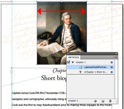
Fixed
Selecting Fixed from the Image Size menu in the EPUB Export Options dialog seems to apply the following image resampling and resizing logic:
- First it looks at the actual pixel dimensions of the placed image.
My source image in InDesign starts at 700px x 883px at 218ppi. - The image is resampled to the set resolution. I used 150ppi which is an average ppi setting for eReading devices. Which changes the image settings to 481px * 607px at 150ppi.
- Before exporting the image-file into the EPUB package, the placement percentage at which the image is placed in InDesign is also considered, and this percentage (77% in my sample) is applied to the image settings. Resulting an image size of about 370px x 467px at 150ppi.

The resulting HTML, applies a few more calculations it seems. As the width and height attributes display the following:

Looking at those figures, I’m wondering where these settings originate from. It seems to be about 50% of the pixel dimensions in step 3 above. When I reduce the image size to be 25% of the text frame width, the HTML result again approximates this 25%, but is not exact.
The difference could be caused by rounding errors, but in all honesty I’m not sure if my theory is correct. But let’s leave this be, as the main reason for this post is to look at what InDesign does with images in various positions when the Image Size setting is set to Relative to Page Size setting.
So what happens when we use the Relative to Page Size setting?
Relative to Page Size
Non-inline/anchored Images

Once again taking the same document I’ve tested with in the prior example and only changing the Image Size setting in the EPUB Export Options to Relative to Page Size.
The physical image size that appears inside the EPUB package is identical to that of the previous example, which I reckon makes sense, as it’s consistent. As the image is about 41% of the page-width, the HTML outcome is no surprise:

Note: InDesign nests images within a paragraph (p) element in resulting HTML. As there is no setting that allows us to define the paragraph style for this presently, the class values are automatically assigned during EPUB export. Resulting in the display of ‘para-style-override-n’ class values.
Inline/Anchored Images
So I wondered if Inline/Anchored images would provide a similar result when using the Relative to Page Size setting and ran a few more tests to try and understand what’s actually going on.
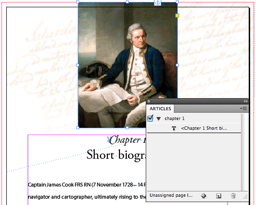
First of all I turned the previous ‘floating’ image into an anchored object, and ran the EPUB Export again. Ensuring that this time I also selected the Settings Apply to Anchored Objects checkbox.
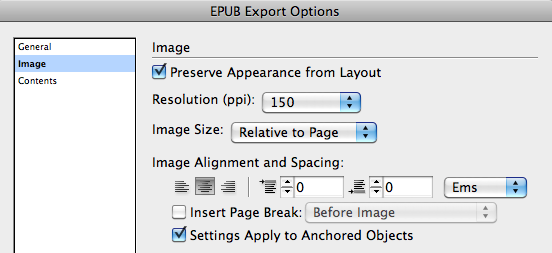
The Settings Apply to Anchored Objects checkbox applies the Image Alignment and Spacing settings to anchored objects. In the example above, it means that although the image is anchored to the start of the paragraph, the image will actually appear above the “Chapter Title” paragraph in the EPUB output instead of inline at the start of the paragraph.

Alright, so considering I’m using the Relative to Page Size Image Size setting, I would expect the resulting HTML to set the width attribute to 41%. However, upon checking the HTML I discovered that for anchored or inline images, InDesign sets the width percentage to the relative text frame width. Which in my example is 50%.
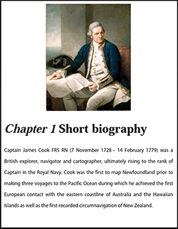
So it seemed at this stage that the relative image width setting is based on the width of the parent object within which it resides.
Text Frames with Text Inset
That begged the question: what happens when a text frame has a text inset AND contains an inline/anchored image. Would InDesign look at the parent text frame and regard the text inset values when calculating the width percentage?
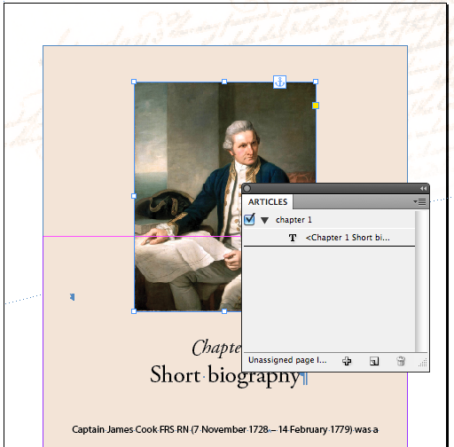
A quick design change, and new EPUB export answered that question. And wow… was I surprised to see the result!!!!
![]()
The width percentage changed to 59%! That is seriously cool! And provides tons of potential in other areas – about which I will write a blog-post later on… I’m trying to stay focussed on the Relative to Page Size setting here… which as you can see now, shouldn’t be taken as ‘relative to the InDesign page size’, but relative to the parent text frame size.
Ok, so I sneaked in another tiny test… narrowing the previous text frame, and pasting that PLUS its inline image, into a new text frame set to the original width and inserting some text in this frame as well… to see if InDesign was looking at the parent of the inline graphic or the top-level parent… and it seems it looks at the parent of the inline graphic itself when setting the width percentage.
So that left the question: Would this work for inline images in tables? Let’s take a look.
Tables with Inline Images
Alright, so I created a simple 2 column table and inserted the inline graphic. The graphic filling 100% of the cell width to check if this relativity to parent object (table cell in this case) would work as well.
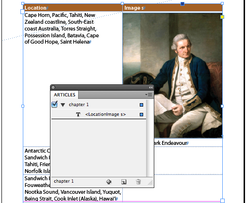
Unfortunately a sad face here 🙁 the visual EPUB results quickly reveals what’s happening:
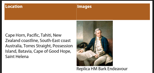
Only the parent text frame is considered when calculating the relative image width, the parent cell width is ignored. This means that the image width will be set to 50% in my example, resulting in the image displaying at half its size inside the table cell.

Take away the following: For the time being be aware that when using inline images inside tables, you’ll need to jump into the HTML and alter the width values for those images.
In the meantime I’ve filled out the feature/bug form, so hopefully in the future the relative width behaviour of images will be further enhanced. Also: If anyone’s figured out an alternate work-around or setting that changes this particular behaviour let me know and I’ll update this post or add a reference to your blog-post on the topic.
A feature enhancement for Adobe would be to remove the confusion that might be caused by the “Relative to Page Size” setting, I would propose changing the Image Size drop-down menu options to read: ‘Fixed’ | ‘Relative’. Additionally ‘Relative’ width settings should be calculated based on the width of the parent element. Thirdly, to eliminate the issue of automatic para-style-override class value assignments, it might be an idea to allow the user to define this ‘external’ paragraph style, either during EPUB Export or as part of the Object Export Options…
A word about iBooks: Just wanted to point out that presently there is still a bug in iBooks (eReader for iPad), that ignores the width attributed set for images. Liz Castro has written an excellent blog-post about this some time ago, that also provides a work-around for this issue. Reference: Controlling Image Size in iBooks.
I have read this through several times and am still somwhat puzzled. I have created my images in Photoshop at 150dpi and given them the dimensions I want. It’s not clear to me how to place these in InDesign CS5.5 so that neither the size not resolution is changed. No doubt this is user error on my part and I’m overlooking something obvious.
Thanks in advance
Chris
@Jamilla you’re welcome. Good luck with your project.
Thanks for this in depth writeup. I’m going to do some trial and error to see what comes of my latest project.
Inline graphic frames wider than the text frame export as width=100% when Image Size = Relative to Page. They crop to the graphic frame. Seems obvious, but because of the opaque nature of the export process I thought it worth testing to make sure.
* * *
One way to keep track visually of how graphics will export might be to work in a document sized 768 px wide with margins of 84 px left and right. It would then be easy to place and preview images that will show full page-width (the text frame, 600 px) or full screen-width if double-tapped in iBooks.
Full screen-*height* needs different treatment because inline graphics taller than text frame cause a text overrun. A document 1024 px high with top/bottom margins of 0 px would work. Guides could be used to show top/bottom iBooks page margins of 82 px.
@Kai there are quite a few style-overrides added in the EPUB export process currently. I noticed that too in this scenario… So there’s definitely still room for improvement.
For instance the ability to define that ‘external’ paragraph style as part of the Object Export settings would be cool, as you could control inline alignment this way as well.
Object styles can be handy to add “div”s in certain scenarios (blog-post about this soon 😉 ) I like using them for break-out text, and in CS5 I used them a for image placement as well. 🙂
Anchoring images and applying the basic settings for alignment creates an extra p-tag for the image in the html-file, although the image is anchored in the next paragraph. That looks at a first glance as a big timesafer 🙂
But: This image has a class “para-style-override-1” and if you apply a objectstyle, this one is lost during the export. So it seems, that it is the best way, to anchor all images in an extra paragraph with p-style. Otherwise there is no chance to deal with css for the image?!
“InDesign sets the width percentage to the relative text frame width.” > Wow! Thanks for this information 🙂 This makes sense.
But think of the iBooks-bug: As Liz Castro described, the width of the image should be set to 100 % and then the parent, in this case a div, should set to 50 %. But, there is no div around the image! So, how could this “relativ to page” be helpful, when this assume a InDesign-page or -textframe and such infos are also ignored by iBooks?
@Tina — Pleasure 🙂 and thanks for the #ff on Twitter too 😉
@Chris you are spot on, I too swap images out ~ if they need to appear full screen at 2x click ~ I am not too concerned about that to be honest. I’ve been thinking of how this possibly could be handled in Object Export Options (feature request). Possible a full screen checkbox that can be selected, and results in InDesign NOT touching the pixel dimensions of the image – making the user responsible for getting the dimensions right -, but InDesign still setting the width % of the placed file relative to parent object it’s in.
InDesign’s image size handling seems to pretty much on par with how things work in HTML, with the exception of tables currently from what I can see. The choice of wording “Relative to Page Size” can lead to confusion for those without HTML/CSS skills.
@Cari: Thanks for doing all this research. I was wondering about this, since I was planning to do a photo book with recommended ID page specs that include margins (768 x 1024 with top/bottom margins of 82 and in/out margins of 84).
I got the same results you did. Anchored images sized at full text width (smaller than ID page width) are full-screen width on iPad. Images sized to full text width, but not anchored, are smaller than full screen width. This is very good to know. Thank you!
@pageboy: CS5.5 gives you the option of exporting as high as 300 ppi, so you don’t necessarily have to crack open those images.
Thanks for running through these tests for us. I haven’t had much time with CS5.5 yet, so this is really useful.
In HTML, applying a width as a percentage must be relative to the containing block. I have always dug in to my epubs and removed real widths/ heights and styled the container with a width. But, there is also the issue of the real dimensions of the image. In fact you want that to be so big that on the iPad, a double click will enlarge to full screen. This may mean that you need replace the images in the ePub with the higher res versions, because InDes. Will have made them too small.
@pageboy
@Harbs and @Bob thanks guys 🙂
Dynamite write up. Very well done!
Great write-up Cari!
Excellent analysis!