“How do I set vertical type in InDesign?” was a question that landed in my email box today. In all honesty, setting vertical type in InDesign does require the opening of ‘the box of tricks’. I’m writing this tip in two parts. The first part (found below) will show you a pretty quick and dirty method you can apply just using InDesign. The second part will look at integration between InDesign and Illustrator.
Vertical Type in InDesign using GREP
For those of you that only have a copy of Adobe InDesign, the following tip provides you with a pretty quick and easy way to set vertical type.
First we’ll start by creating a Text Frame that has our soon to be vertical text set in it. For the best result, set the text alignment to Align Centre.
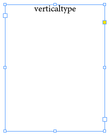
Now that we have the text frame with our text on the page. We’re ready to convert this to Vertical Text.
Getting to GREP
The work-around I choose to use for this is the insertion of a ‘Forced Line Break” … that’s hard work!!! Imagine having to manually press Shift+Return/Enter after each character… surely there must be a quick way to do this?
Oooh yeah… there is… We’ll be using a super-duper quick GREP Find/Change for this.
From the Edit menu choose Find/Change and click the GREP tab
I’m using the GREP option here, because it allows us to search for every individual character in the selected text frame (Story) and say .. “now go and put a forced line break behind it”…
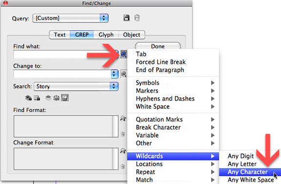
Click the metacharacter menu on the right of the Find what part of the dialog. Metacharacters incidentally are characters that have a special meaning in InDesign.
We’re looking really for any type of character, so let’s choose Wildcards > Any Character.
This adds a single full-stop in the Find what field in the dialog box. Super.
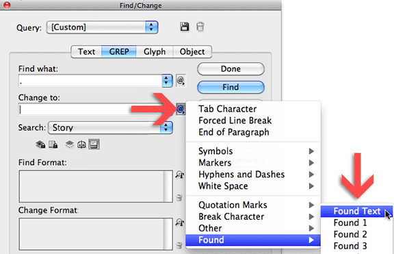
Now on to changing things… What we need to do is put the originally found text back AND add a forced line break behind it. So here we go.
From the metacharacter menu on the right of Change to, choose Found > Found Text. This adds a $0 in the Change to field.
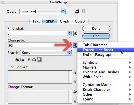
Next from the same menu choose Forced Line Break. This adds \n to the Change to field.
Before we do anything else, ensure the Text Frame is selected, and set the Search option to Story. Then click the Change All button.
Changing the space between characters
In one quick hit, the text will appear Vertically (in reality the text is now broken over a number of lines).
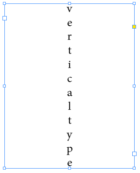
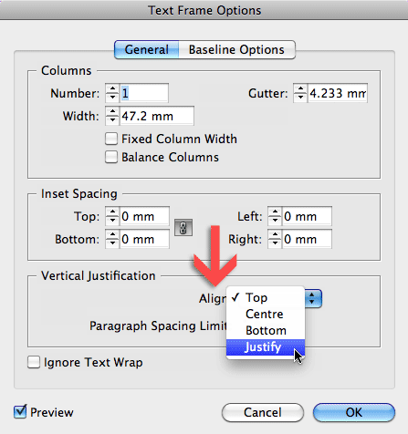
To control the spacing between the characters, either alter the Leading for the text, or set the Vertical Justification to Align Justified (Object > Text Frame Options).
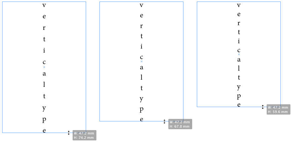
The latter provides you with a nice click and drag method to expand the height of the text frame and automatically insert more space between the characters.
For some alternate approaches you can also refer to David Blatner’s post on the InDesign Secrets blog. A very nice article outlining another couple of InDesign vertical type methods.
@pixelbus That does change the direction if you set type on a vertical line (rotated display)… but how do you control the spacing between the characters? On a veritcal line Tracking seems to have some weird effects? and Spacing doesn’t work at all, as that’s designed for adding/reducing space on curved paths afaik. — Cari
how about type on a path tool > select text > right-click> type on a path > Options > effect – stair step
Hi Rachelle, are you starting by setting the name in a text frame on its own? Type the names horizontally first. Then use the GREP technique. Feel free to email me screenshots of your settings, and I’ll take a look at it for you. — Cari
I am trying to create vertical text for personalizations. Customer wants the name to be placed vertically on the page. I tried your method above, but received “Cannot Find Match”.
I greatly appreciate this tut! The directions were great.
glad the tip was of help Sue 🙂
Asian characters often and are vastly used in vertical format
@Gavin
Have to agree, it looks a little silly in the lower-case example I’m using 🙂
You see it a bit in poster designs I’ve noticed.
Cari
Usually, when we see type done vertically like this, it is part of a design element, and most often done in all caps.
Gavin Anderson
Senior Creative Graphic Designer
A S Hospitality
Thanks Tracy.
Good point. Don’t see vertical type as part of a graphic design too often I reckon… Unless it’s a bit of a letter game.
Anyone out there have some screenshots to share of samples that use vertical text (excluding cross-words 😉 )
Cari
Very clever Cari. I personally do not like vertical type used this way and wonder how many other designers would choose to use it? What do others think?