Note that this trick does not work in CS5, or CS5.5,
as Adobe’s changed the Text Frame / Text Wrapped object interaction behaviour.
Vertical Justification… according to Webopedia is the “automatic adjustment of vertical space between lines, so that columns and pages have an even top and bottom margin” … In InDesign Vertical Justification really refers to the vertical alignment text has within its text frame.
Vertical alignment can be changed by choosing Object > Text Frame Options… In the General section of this dialog box we find the Vertical Justification Setting.
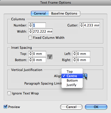
It contains four (4) different alignment options. Top, Centre, Bottom and Justify.
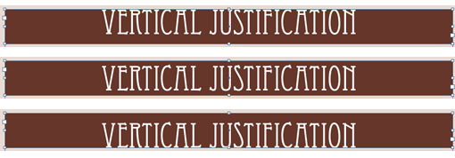
InDesign’s default Vertical Justification setting is Align Top. We can easily change that using either the Text Frame Options dialog or by clicking the preferred Vertical Justification button in the Control Panel.

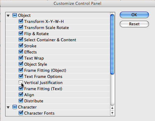
You don’t see these buttons in your Control Panel? In that case either your monitor settings don’t allow for adding of more control panel buttons or this particular option is not enabled as a button that can be displayed in the Control Panel. The first reason could require you to increase your screen resolution (or purchase a new monitor that allows for increased screen resolution settings). However, you do have some control over what you see in the Control Panel 🙂 It’s called the Control panel for a reason I guess…
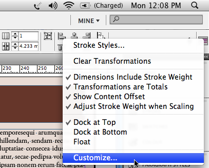
From the Panel menu on the far right of the Control Panel, choose Customize… Click any of the triangles before Object, Paragraph etc. to twirl down and display what settings can be displayed in the Control Panel. Was Vertical Justification selected? No? Then enable it, and with a bit of luck – after clicking OK – you’ll be able to see the buttons 🙂
Ok, now let’s look at the last of the Vertical Justification settings: Align Justify.
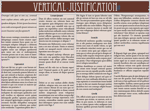
I have the bottom frame selected on my page, and as you can see the frame is defined as having multiple columns. However, although the text lines up nicely at the top of the columns, it is rather ragged at the bottom. Not a pretty sight.
A similar affect you might see when looking at two neighbouring pages in a long document that uses “Facing pages”. Not pretty at all.
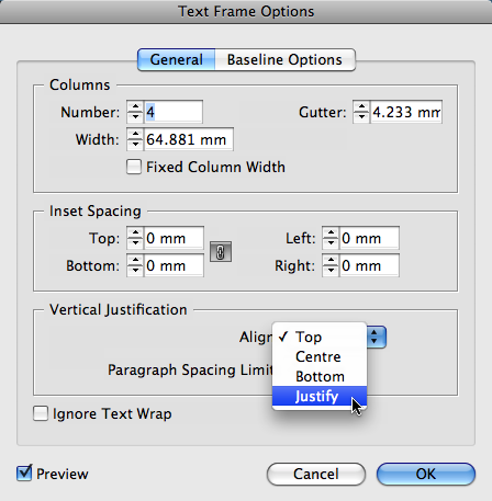
To ensure that both Top and Bottom of the text in the frame is nicely lined up, change the Vertical Justification setting to Align Justify.
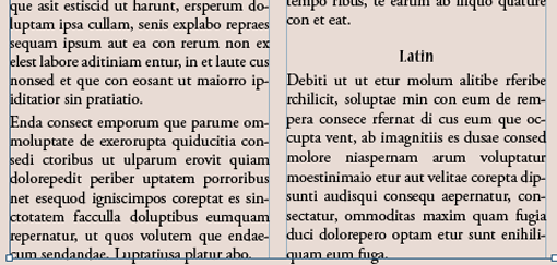
Nice right? What you don’t like it? Aaaah, I see. It appears as if the text in neighboring columns has a different leading now. Still not a pretty sight.
Why did that happen? InDesign basically needs to insert some space in order to make the text line up at top and bottom of the frame. And for shorter columns it will need to insert a lot more space. It inserts this space anywhere… that’s right… anywhere… between the lines within a paragraph and between the paragraphs themselves.
Where a lot of space is inserted between lines of a paragraph it will appear as if the leading has increased.
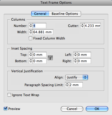
To avoid this from happening and instruct InDesign to first of all try and justify the text vertically by adding some space between paragraphs, increase the Paragraph Spacing Limit setting.
A setting higher than “0” instructs InDesign to insert up to the defined amount of space between paragraphs first, prior to starting to place space between the lines within a paragraph.
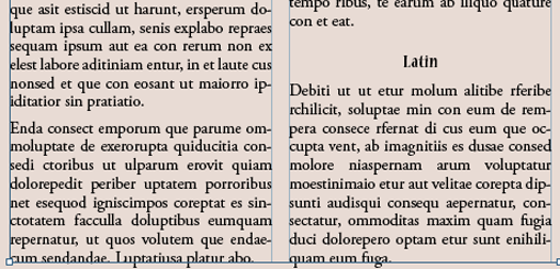
Ok, that seems to improve things. But what happened to the last column of the story? Vertical Justification doesn’t know when to stop!
The End of Story, be it in a mutli column frame or the last page of a chapter in a book doesn’t require the Justify setting to be enabled.
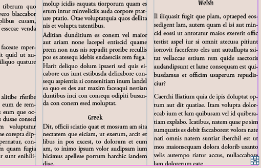
For a mutli column frame we can’t just disable the Align Justify setting on the text frame, as it will affect all columns. However, making the column interact with a small object that has Text Wrap enabled on it will ‘switch off’ the setting for just that column (or Frame in case of long documents, e.g. end of book chapter).
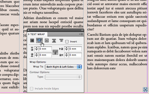
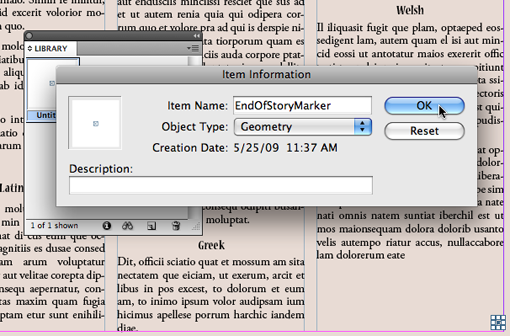
To easily insert this so called “end of story marker”, I place the object in an InDesign library, so I can grab a copy of the ‘shelf” each time I need create an “end of story marker” that fixes this “always justify alignment everywhere issue”.
To create a new Library, choose File > New > Library. The library itself behaves much like an InDesign panel. It is totally empty when first created.
To add an item to the library for reuse, select the item on the page then choose Add Item from the Library Panel menu.
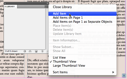
TIP: press Alt/Option as you are doing this and you’ll be prompted to name the item. Alternatively double click the Untitled item you’ve just added to name it.
I can place it as a floating “object” but if for some reason more text is inserted, the object will stay behind and continue to cause a particular column NOT to be justified. So instead I insert them as an Inline item (Anchored Object) that flows with the text when more text is inserted.
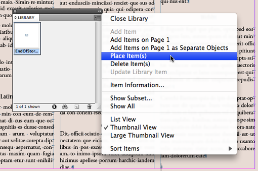
At the end of your story insert your type cursor and press return/enter. This places your cursor on the next line. From the Library Panel menu choose Place Item(s)… and you’re done.
Note: You can even add a Keyboard Shortcut for the Place Item(s) command 🙂 to make things even easier and faster.
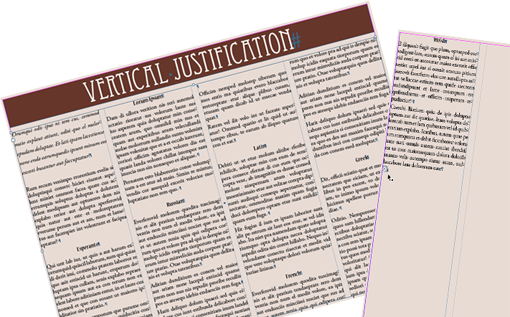
Now no matter where the story ends, the last column of the story will never be justified.
Video Tutorial
This saved a lot of time for me. I am in CS6, and using the 5th wrap option (jump to next column) for the end of story marker worked great.
Thank you thank you!
How do I change the default vertical justfication in INDesign CS5?
When I paste text that is at the top of the box from one document into another the document text box I am pasting into vertically justifes the text . . . .
BD((
ANY help would be great;y appreciated
Sounds like the default has changed for that particular document. From Edit menu choose Deselect All. Then choose Object > Text Frame Options and set Vertical Justification Alignment to ‘Top’ … this will now only set the default for newly to be created text frames in the problem document. For existing text frames, see if there is an Object Style applied, and amend the object style 😉 Hope this helps, Cari
ha, Barney you’re spot on… that work-around / trick doesn’t work in InDesign CS5+ anymore. Going to puzzle on a solution and if I come up with one I’ll devote a blog-post to it… but must admit, I ‘fear’ this one might need to be scripted 😉 For now… it’s back to the ‘old days’ where you’d need to switch off the ‘justified’ setting on the last frame Alignment. 🙁
Hi, I found this when I was looking for a solution to the vertical justification at the end of a story, but when I added the box, nothing happened.
Apparently, InDesign CS5 and up now ignores text wrapping for vertical justification. Do you know of a new solution for ignoring vertical justification at the end of a story in CS5?
Great post, Cari! I love the end of story marker technique.
Hi Pariah,
Thanks heaps 🙂 Was fun writing it.
I’ll record a movie for YouTube soon… Had one done, but it was too long to post 🙁 so gotta do it again 🙁