Digitip 078 – Adobe InDesign, colourising and fake duotones
Greyscale and line art (Black & White) images placed in InDesign can be colourised. So how can we create cool colourisation that pretends to generate duotone effects?
Ok, so let’s start by bringing in a greyscale or black and white image and applying some colour to it. First of all when colouring the image, ensure you select just that… the image. Double click with the Selection Tool to access the image or else use the Direct Selection tool to select the image. To apply colour to the image click a colour in the Swatches panel or else assign colour through the Colour Panel.
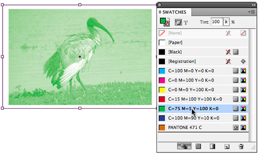
To use an image as a background tint, reduce the Tint percentage in the Swatches panel.
The Fake Duotone
To create a fake duotone effect utilising a mixture of a spot (Pantone) colour and Black, first add the spot (Pantone) colour to the Swatches panel. Select New Colour Swatch from the Swatches Panel menu, then set the Colour Mode to the spot colour chart of your preference.
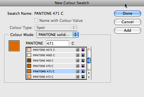
Click Add to add the selected colour to the Swatches panel.
Once you’ve got at least one spot colour added, you can use this colour to create the new mixed ink colour that will consist of spot and black colour inks. From the panel menu select New Mixed Ink Swatch.
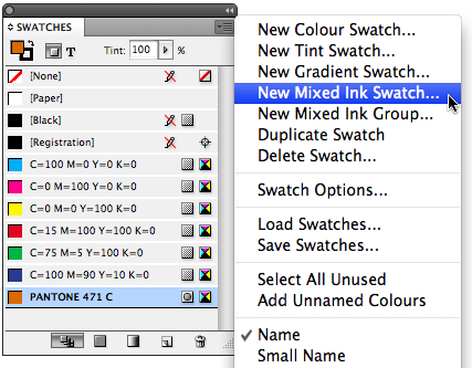
The New Mixed Ink Swatched dialog pops up. We’re ready to set the ink-mix. The thing to remember is that a mixed ink swatch must always consist of at least one spot colour. (see also previous post for some fun stuff to do with Mixed Ink Swatches and Mixed Ink Groups)
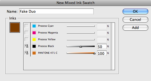
I’m keepng things pretty basic here, by selecting a 50-100 mix of black and spot colour. Click Add to add the colour to the Swatches panel and Done when finished adding new swatches. (You can continue to create new mixes and press Add to add multiple swatches without the need to close the dialog box).
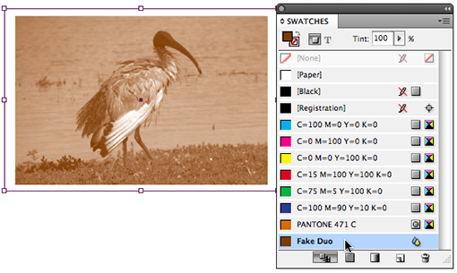
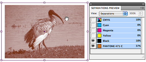
With the Fake Duo swatch added, we can colourise our graphic again. A look at the Separations Preview panel will display that indeed we’ve managed to mix a spot and black colour.
@Tight Designs:
Visually if both objects were on a white (paper) background you wouldn’t see a difference, but when you move the objects over the top of other objects you will see a significant difference: Opacity creates transparency and tint does not.
To test this out add a photo to a page, and place an object over the top that you fill with 100% tint of a colour. It should hide the photo completely.
Then change the tint of that object to 50%: the photo below remains ‘hidden’.
Change the tint back to 100% and change opacity of top object to 50%, now the photo below it becomes partially visible.
I was shown a technique in Corel, where you would minimize the amount of a color’s % to produce less dots to be printed on the paper.
I looked around InDesign and I THINK it’s the Tint option, but I’m not sure, because when I save as a PDF or in the InDesign workign file, I see a lower Opacity and not the dots of color.
Can you tell me the difference between Tint and Opacity?
@Barb:Are you absolutely sure the image is a Grayscale or Bitmap image? You can check this by opening the image in Photoshop and choosing Image > Mode.
For instance if the Mode is set to RGB or CMYK, the swatches panel will indeed be greyed out.
Also one other note: You can not colourise transparent greyscale images.
Help! I’m doing everything step-by-step per your instructions, but it’s not working. I click on the greyscale .tif image and, when I open my swatch panel, all the swatches are “greyed” out and I can’t access them. What am I doing wrong??
thank you for those kind words! You are most welcome!
You are our hero! Thanks!